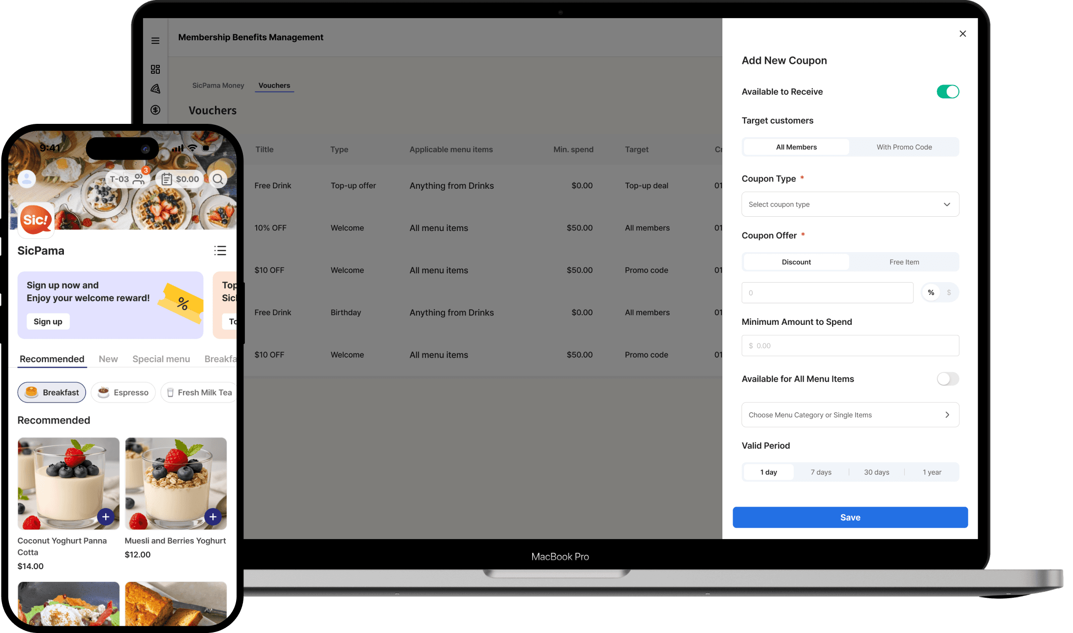
SicPama Diner QR Ordering
SicPama develops services that help restaurants improve performance and enable customers to place group orders at the table. This project focuses on improving the basket to checkout experience in SicPama’s QR ordering system to reduce cognitive friction and improve usability.
My Role:
Company:

Key Outcomes:
25%
reduction in time on task
40%
decrease in interaction cost
Clearer group-order navigation and reduced cognitive load
Problem context
What was wrong before?
Despite a relatively simple ordering flows, users consistently struggled during the basket → checkout transition
From usability testing and session observations, I found several recurring issues:

Users attempted to check out before selecting a payment option

Users scrolled up & down, tapping too much to understand what to do

Users paused after failed actions, then gave up or asked for help

Research
Observations
Usability Testing
Competitors Analysis

Synthesis
User Behavior Analysis
User Journey Map
Hypothesis

Ideation
Design Strategy
User Flow
Wireframes

Design
Design Iterations
Design System Update
Final UI

Conclusion
Final test
Delivery
Reflection
Research Results
Problems with the old design
The original QR ordering flow was designed to enable groups to place table orders as quickly as possible.

However, quantitative analysis revealed significant issues:
~24
Max touch interactions
13s
Avg. time on task
4-5s
Pause time needed
Session replay analysis revealed clear problem points in the user journey:


Synthesis
Root causes of the problem

Users repeatedly tapped avatars (often repeatedly or aggressively) expecting them to show something
Hidden prerequisite
Selecting a payment option was required
but:
Group order payment is a new experience, users don't expect it at Basket/Cart
It was placed at the very bottom of the screen.
Users scroll up & down, feeling confused,
and trying to understand how to continueAs the number of users and items increased, interaction cost increased exponentially.


Two major tasks combined in one screen
"The time it takes to make a decision increases as the number of tasks and options increases"
UX Laws: Hick's Law
Additional findings
Unclear payment option selection at the basket stage caused confusion and drop-offs.
Comparative insight:
Flow without payment option selection took 50% less time
This confirmed that checkout structure was the primary source of friction.
Based on UX research and analysis, it was obvious:
Key Insight:
The mismatch between the basket structure and users' mental models
was the primary cause of confusion, excess taps, and delays
Ideation
Design Strategy
My strategy focused on separating cognitively distinct tasks into sequential steps that matched users' expectations. The flow was restructured to ensure one primary cognitive task per screen:

Ideation
Low-fidelity wireframes
Design
Final Design Solution
Functional group tabs
User avatars were transformed into functional tabs
Users can tap avatars to view individual group members’ orders
Avatar tabs match user expectations
Clear visual separation between group members' orders
Reduced interaction cost, requiring only one tap to view another user’s items

New Checkout screen
Basket is now a review space only
Checkout focuses on deciding how to pay for the group orders
Payment options appear when users expect them
Reduced cognitive load at decision points
Fewer swipe loops and exploratory taps
Order summary at Checkout
An order summary is displayed at the bottom of the checkout screen to support payment decisions.
Easier to make a decision
Faster understanding


Clear payment details
The selected payment option clearly shows who pays and how much.
Non-interactive elements were visually simplified, and arrows were added to expandable components.
Improved completion rate
Reduced checkout abandonment
Validation
User validation
Testing results:
25% reduction
in time to reach payment compared to the previous flow
40% decrease
in interaction cost due to elimination of repeated failed actions
2→1
Primary decisions required at a single step
Although the redesigned flow introduced one additional step, it significantly reduced worst-case interaction cost. The maximum tap count dropped by 40%, meaning reduced confusion and less exploratory behavior.
Currently, this project is at the prototype and testing stage. Here's what I planned next:
Post-launch metrics to track:
Order completion rates
Drop-off rates
Conclusion
Reflection
By separating review and payment options into different steps, the redesigned flow aligns with users’ expectations, reduces cognitive load, and creates a more predictable and scalable checkout experience for group ordering.
Lesson Learned:
Have any questions?
We can discuss them in an interview environment or a coffee chat :)
Recommended next


SicPama Loyalty
2025
10 min read
How removing membership tiers made a delayed loyalty product shippable in 2 months
Loyalty MVP Design · B2C Mobile Ordering · B2B Management Portal

Mindsight by Nodamen Inc.
2024
8 min read
Designing mindfulness & emotional resilience product from 0 to 1
Product Design · UX Research · AI Mentor Design


