SicPama Loyalty
Project Overview
SicPama
CEO, CTO, Engineers, business partners, and me
Solo Product Designer (end-to-end)
Integration into B2B merchant portal + B2C mobile ordering
2 months
Defined MVP scope from a broad brief
Shaped product logic and functional requirements
Planned information architecture and feature integration across B2B and B2C surfaces
Designed key flows, wireframes, and final UI
Built a foundational design system and prepared handoff files for implementation
Impact at a Glance:
Delivered MVP in about 2 months after the project had been delayed with no designer
Simplified MVP scope, significantly reducing research, UI, and development complexity
Designs successfully approved by stakeholders and business partners
Established a reusable digital loyalty foundation for SicPama’s first rollout merchants
Introduction
Product
SicPama helps 22+ restaurants in South Korea, Singapore, and Malaysia manage operations and accept QR-based group orders at the table. Key merchants had been promised a digital loyalty system — integrated with the merchant CRM and customer QR ordering app. No one had been able to design it.
Some details have been omitted to comply with a non-disclosure agreement.
Challenge
Goal:
Merchants needed a loyalty program to drive repeat visits, membership adoption, and upfront cashflow.
Initial brief:
Full tiered membership loyalty system built on stored-value credits, vouchers, progression & regression rules, and multi-level logic.
Challenge urgency:
The company had no designer when the project started. By the time I joined, there was real urgency to show merchants something buildable.
Status Quo & Constraints
Before this project:
1
There was no loyalty infrastructure.
Promotions were managed manually — slow, error-prone, and impossible to scale
2
No digital redemption existed inside QR ordering.
Customers depended on staff, and promotions were largely invisible to diners
3
Engineers had begun building without design input and produced a prototype that was confusing and difficult to use
4
There wasn't even a consistent design system in the ordering app.
Constraints:
1
Hard deadline: merchants needed something demonstrable as soon as possible
2
Partner dependency: Partners' POS had operational requirements that had to be accommodated
3
Existing CRM patterns had to be respected to keep dev effort manageable
4
Merchants can personalize their ordering app, so loyalty components had to work across visual configurations without per-merchant redesign.
The Pivot
Cutting Tiers Before They Cut the Project
The original brief proposed membership tiers based on stored-value top-up amounts: pay more, reach a higher level, unlock slightly better benefits. On paper it resembled a loyalty system. When I mapped the logic, it didn't hold.
Tier progression was purely payment-based with no meaningful behavioral driver
Benefit differences between levels were small and hard for customers to feel
Building it correctly would require dedicated research to define meaningful thresholds, additional UI, complex edge-case handling, and significant extra development time
More importantly: none of it was necessary to achieve the actual business goals


I brought this analysis to the stakeholders and business partners. The pivot was straightforward once the tradeoff was visible. Drop tiers from Phase-1 and focus on two mechanics that directly served the business goals with a fraction of the complexity:
Phase 1 MVP scope:
Stored-value top-up deals
Modeled on promotional materials merchants were already running offline (e.g. "top up $300, get $350 + free beer"). Pre-pay and receive bonus credits. Supports upfront cashflow and creates clear deal value for customers.
Membership vouchers
Welcome and birthday vouchers with configurable rules: expiration, minimum spend, menu category restrictions.
This preserved the main business goals—repeat visits, perceived value, and upfront cashflow—while making the project shippable.
Design Decisions & Feedback
How Should Top-Up Purchase Work?
Once the scope was set, I proposed multiple top-up purchase flows that needed a deliberate call. Here are the main options:
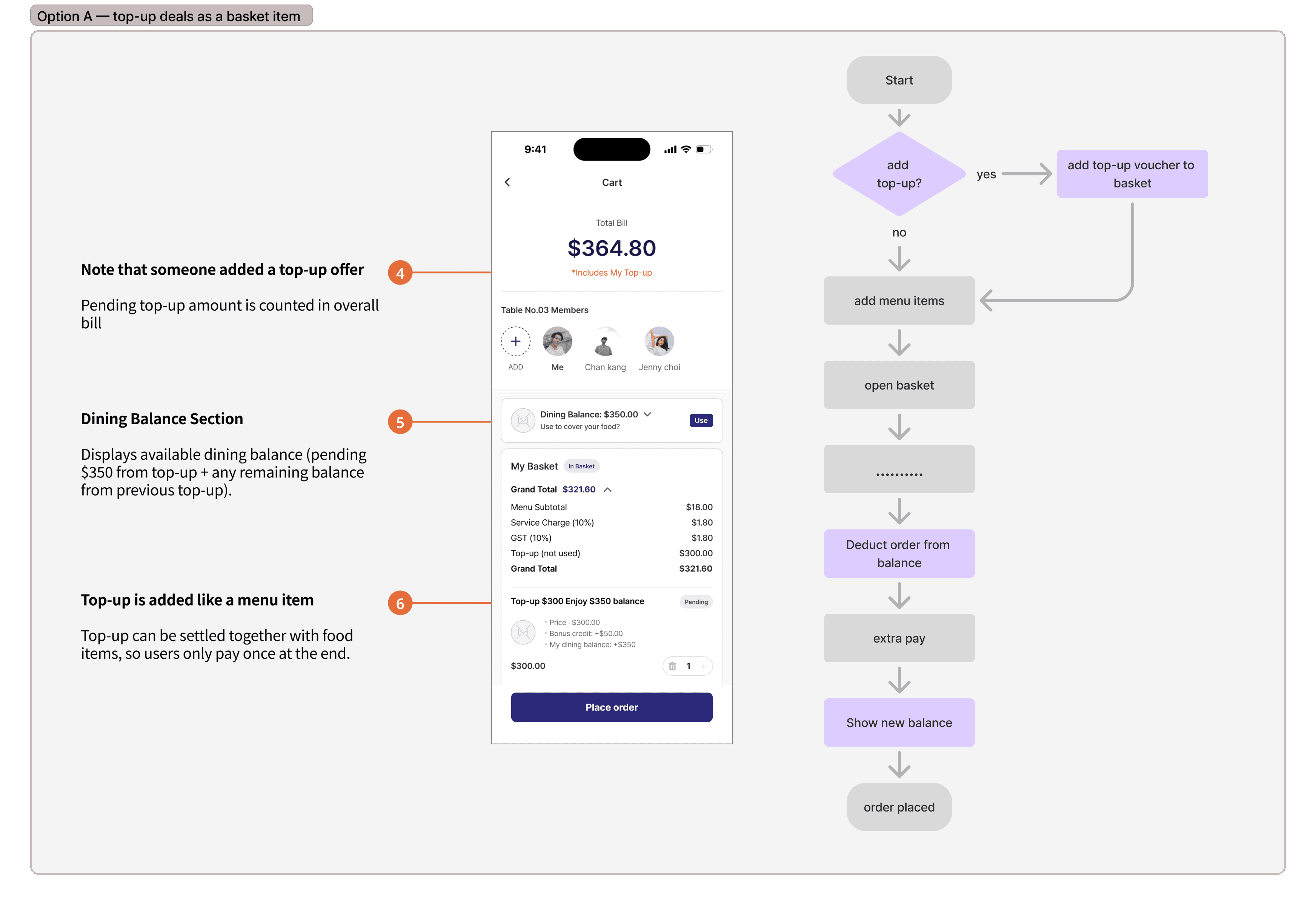
Option A — top-up deals as a basket item
Users add a top-up deal to their basket alongside food and pay for everything in one checkout. Lower friction for individual customers ordering alone.

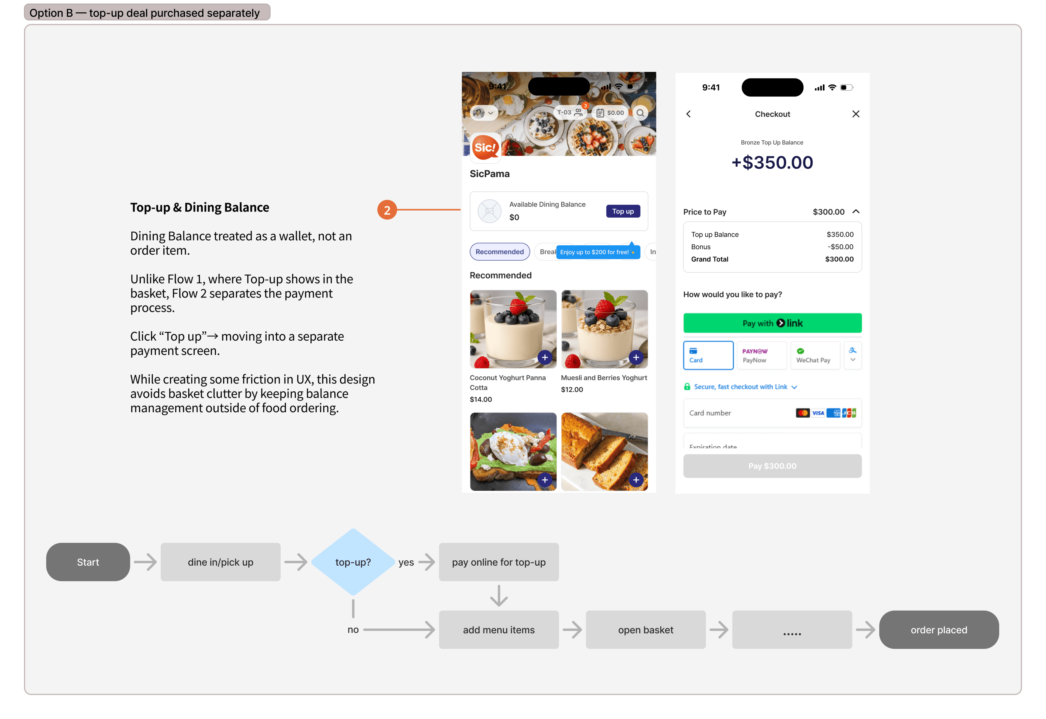
Option B — top-up deal purchased separately
Users pay for top-up as a standalone transaction before or after ordering. Balance updates immediately.

Design Decisions & Feedback
Two Markets, Two Redemption Models
Our stakeholder discussion validated the overall direction, but revealed a market mismatch:
Some merchants in Singapore needed staff-controlled redemption rather than fully self-serve online redemption:
Merchants want to verify redemption before customers left the counter.
It matched existing workflows and prevented walk-away risk.
To-be
Rather than force one model, I designed for both:
POS controlled redemption - the app guides customers through a verification process at the counter.
Online redemption - customers apply stored value and select vouchers directly in SicPama app before paying


New User Flows for Pay at Counter
After discussing all the details again with the stakeholders, I defined functional requirements and created detailed customer-side user flows.

Information Architecture:

Low-fidelity wireframes:


Design Solution
B2B Merchant Loyalty Program Management
For the merchant portal, I intentionally built on existing CRM patterns to reduce design and engineering overhead. The priority was operational clarity and fast adoption, not introducing new visuals.


2. Vouchers management


Design Solution
Design System Preview for B2C Mobile Ordering
The ordering app had no consistent design system, which was slowing delivery and created inconsistency. I built a foundational system covering tokens, components, and patterns for both existing app surfaces and new loyalty features. My goal was to ensure that the new system should be fast to develop, efficient for fast QR ordering, and reusable for any type of SicPama's merchants.

Design Solution
B2C Mobile Ordering


Top up deals purchase


POS redemption


Online redemption


My account (balance, vouchers, transaction history)


Conclusion
Results
Delivered MVP in 2 months after delay with no designer on the project
Multiple rounds of stakeholder feedback completed; stakeholders and business partners were satisfied
"Design is good, I like it", "Best designer we had so far" - SicPama team
First digital loyalty system for SicPama merchants
currently in development & testing stage
Tradeoffs:
Complex Membership Tiers VS Simple Loyalty MVP
Dropped membership tier levels. The complexity cost was disproportionate to the Phase-1 behavioral value. Tiers remain a logical Phase-2 addition once the foundation is in active use.
Top-up Separately VS Single Checkout Flow
Implemented separate top-up checkout. Higher first-time friction, but the only viable path given SicPama's group-order architecture.
Dual Redemption VS Online Redemption Only
Dual redemption model added scope but made the system usable for different merchants. A single-model system would have failed at rollout.
Learnings
The highest-leverage work in this project was not the UI itself, but making the scope tradeoff visible early enough to change direction. Once I demonstrated that tier logic added significant complexity without improving the core business outcome, the team could align around a more realistic MVP.
This project reinforced that product design is often less about adding features and more about making tradeoffs visible early enough before they become expensive.
Lesson Learned:

